Customer Central - Designing an advocate-centered support platform

Overview
Customer Central was an ambitious effort to redesign the support advocate experience from the ground up. We replaced a patchwork of more than five internal tools with a single, cohesive platform used by over 8,000 Cash App 'advocates' to investigate issues, take action, and communicate with customers at scale.
The core problem was cognitive overload. Advocates navigated fragmented systems, rigid policies, dense knowledge articles, and unclear workflows while handling live conversations. Simple tasks like finding a transaction could require jumping across dozens of tabs. The constant context switching slowed resolution and weakened the quality of support.
Our goal was clear: build an intuitive internal SaaS product that reduced cognitive load, supported confident decision-making, and helped advocates deliver fast, accurate, and genuinely caring support as the business scaled.
Approach
I partnered closely with product, engineering, operations, and research to understand how support actually worked day to day. We interviewed advocates across teams and tenure levels, shadowed live cases, and reviewed escalations to pinpoint where breakdowns occurred.
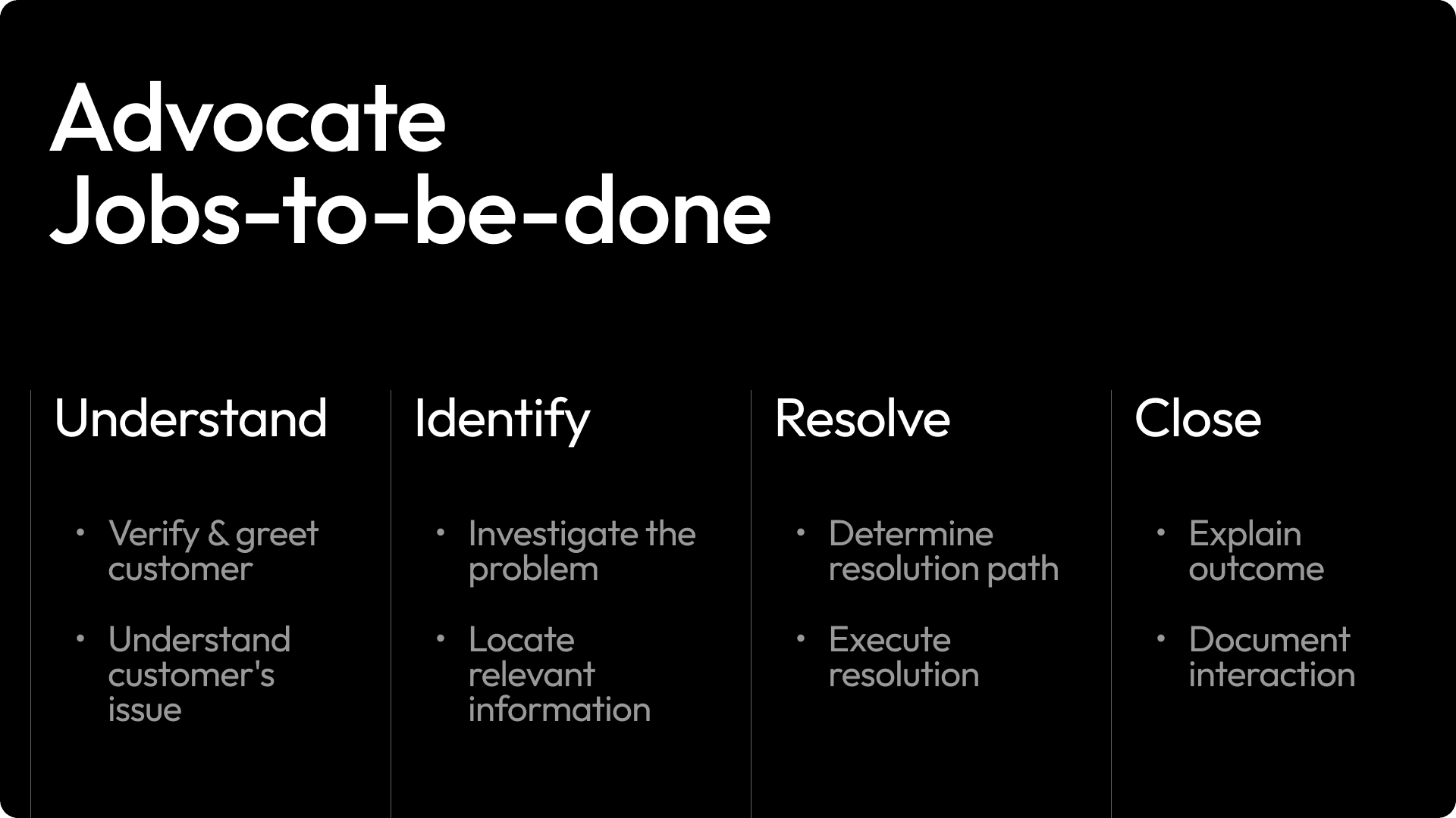
This research culminated in a detailed journey map paired with a deeper analysis of advocates’ jobs to be done. Mapping the full lifecycle of a case, from first contact through resolution and follow-up, revealed four critical moments: understand context, identify the issue, resolve it, and close the loop. These stages became the structural backbone of the product.
We realized the problem was not a lack of information, but too much information delivered at the wrong time and in the wrong format. Advocates needed situational clarity in the moment, not long articles or reactive searches. This insight shaped a core principle: information at the point of need.
To validate direction early, I led a cross-functional design sprint to prototype and test solutions directly with advocates before moving into execution.
Solution
We reframed Customer Central from a collection of tools into a coherent, advocate-centered workspace.
Unified transaction search and filtering
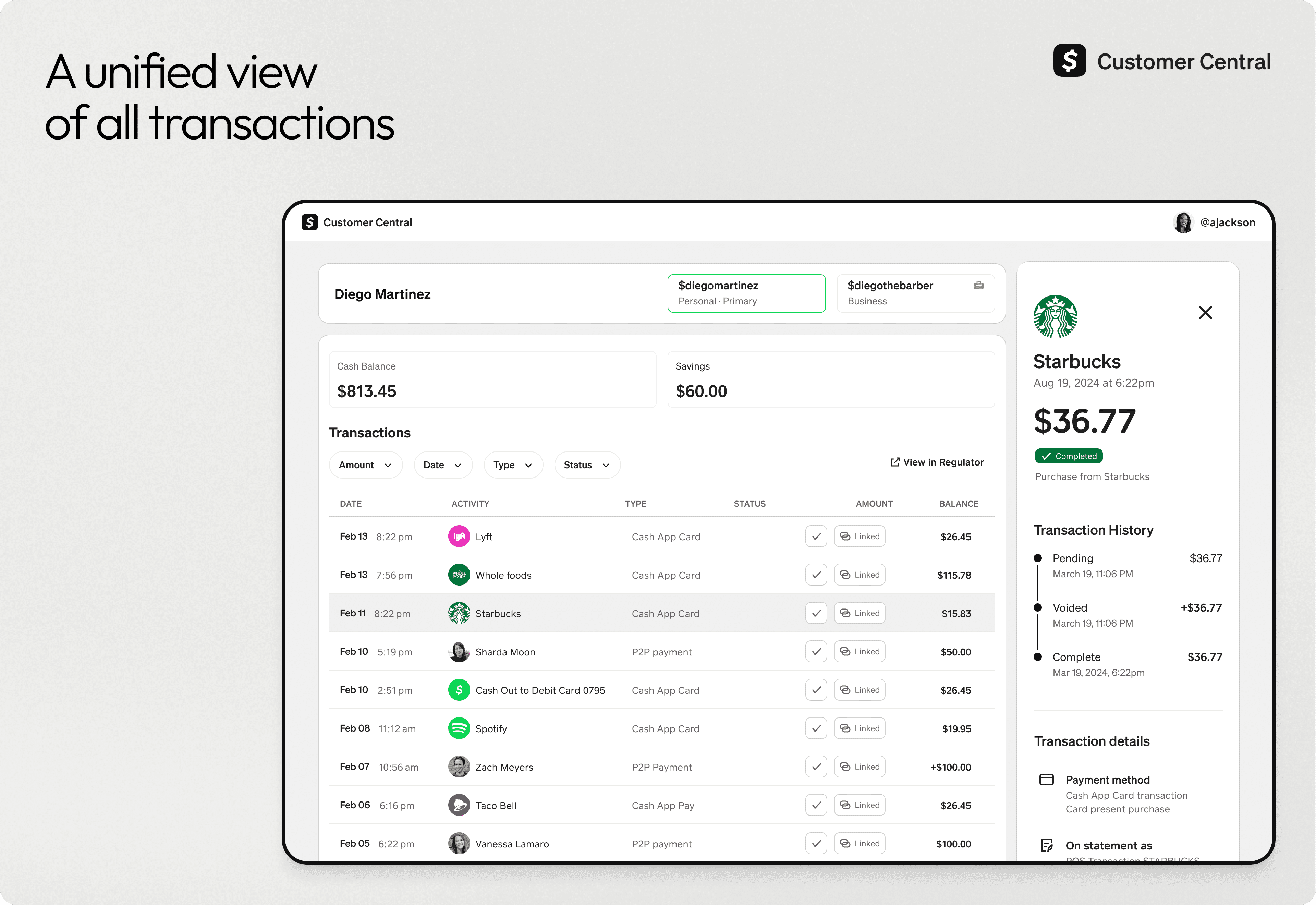
Over 60 percent of support cases involved a transaction, yet advocates had no simple way to locate or understand a customer’s transaction and balance history. We introduced a unified, searchable transaction table that consolidated data into a single view. This dramatically simplified investigation and reduced time spent jumping between systems.
Conversation-first design
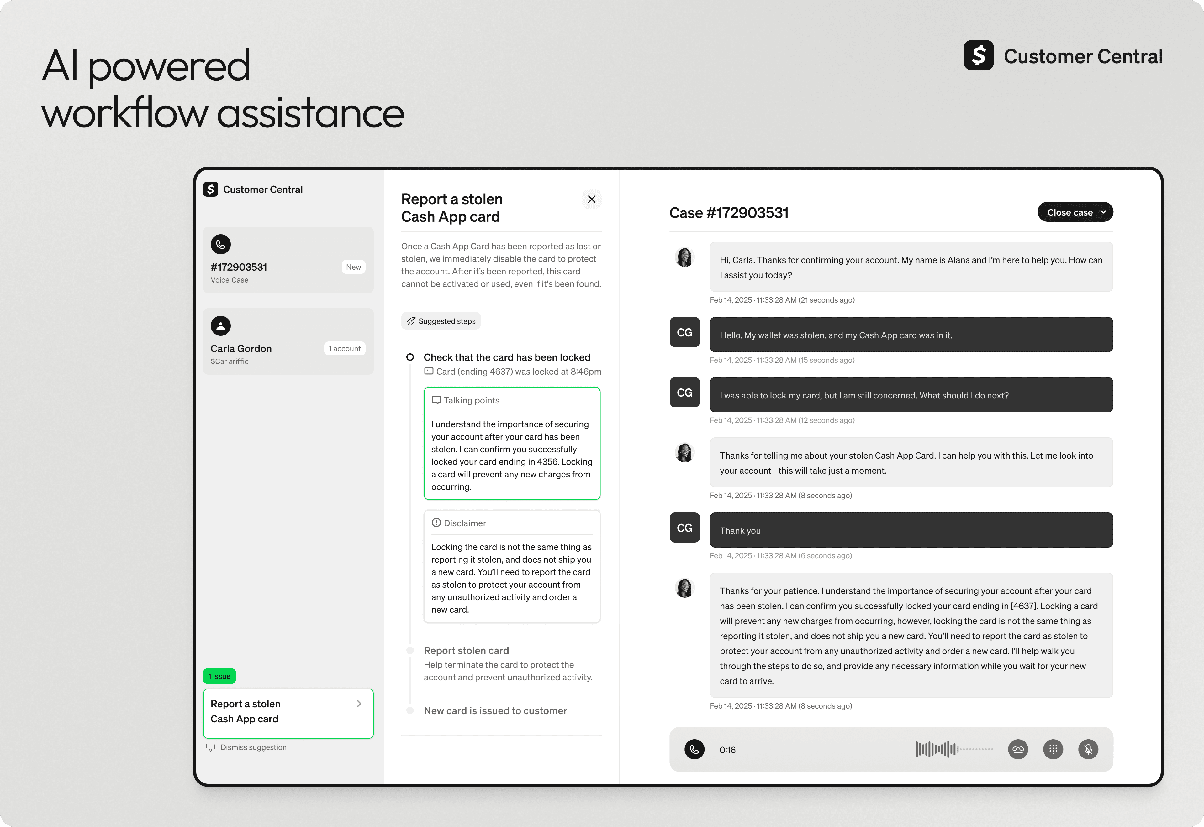
We anchored the interface around the live customer conversation. Context, actions, and suggested language appeared alongside the interaction instead of competing with it. The system supported the advocate rather than distracting them, helping them stay focused during high-stakes moments.
Glanceable customer overview
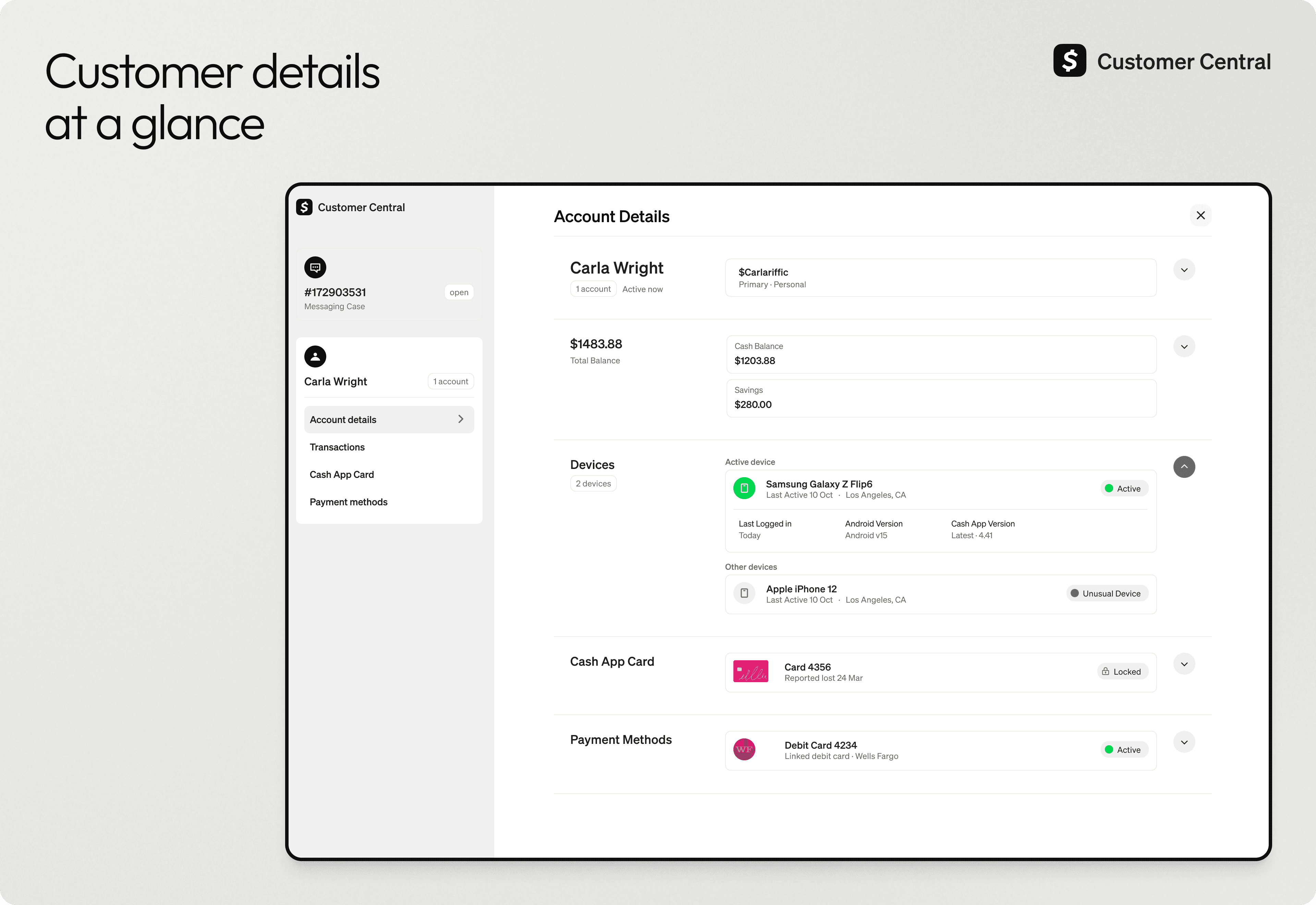
We redesigned the customer landing page around customer-facing objects rather than internal system concepts. This gave advocates immediate orientation at the start of a case and aligned their mental model with what the customer sees in the app.
Extending the design system
Customer Central required higher information density than our mobile products while still feeling unmistakably Cash. I extended our mobile design system, Arcade, into a desktop-first system by adapting hierarchy, spacing, and layout patterns for complex, long-running support work.
Wherever possible, we mirrored the customer experience so advocates and customers were grounded in the same language and product model. To move quickly, we re-themed an existing component library rather than building from scratch. This allowed faster delivery, stronger consistency, and a foundation other teams could build on.
Impact & Reflection
We shipped version one with the unified transaction table and customer landing page. For transaction-related cases, we reduced average handle time by over one minute. At Cash App scale, that equated to more than twelve million dollars in projected annual savings.
Shortly after launch, the organization pivoted toward AI-first support. While the direction changed, the foundations we built informed later AI experimentation, especially around trust, transparency, and human judgment in assisted workflows.
This was the largest and most complex project I’ve led. It sharpened how I think about systems, collaboration, and measurable impact. Even in a pivot, the work mattered. It continues to shape how I design AI-assisted and agentic support experiences today.

